# Function generating data affected by Simpson's paradox with an
# Association Reversal
gensimpsondata <- function(N,                         # Within village beta.
                           beta       = c(-1,-1,-1),  # Within village beta.
                           mu         = c(5, 10, 15), # Mean of X within village
                           sigmax     = rep(2, 3),    # SD of X within village
                           sigmau     = rep(6, 3),    # SD of error term
                           groupFE     = 15,          # Fixed effect of Group
                           name_groups = "Village") {
  groupNo <- seq(length(mu))
  groups <- paste0(name_groups, " ", groupNo)
  datasetlist <- list()
  for (i in seq(1, length(groupNo))) {
    datasetlist[[i]] <- dplyr::tibble(
      GroupNo = groupNo[[i]],
      Group   = rep(groups[[i]], N),
      GroupFE = groupNo[[i]] * groupFE,
      X       = rnorm(N, mu[[i]], sigmax[[i]]) + groupNo[[i]],
      # X depends on village level effects
      U       = rnorm(N, 0, sigmau[[i]])
    ) |>
      dplyr::mutate(Y = beta[[i]] * X + GroupFE + U)
      # Y depends on X and Village level effects.
  }
  out <- dplyr::bind_rows(datasetlist)
}
# Generate one iteration of the data called "example".
example <- gensimpsondata(N = 1000)This is the first post in a series called Bernie’s statistics aide-mémoire where I strive to understand various econometric concepts with simulations and other techniques. This first entry is dedicated to Simpson’s paradox, a well known phenomenon occuring when considering data at multiple levels of observation.
Simpson’s Paradox
Simpson’s Case Study
Simpson’s paradox has been defined in multiple ways over the past few decades and the Stanford Encyclopedia provides an excellent theoretical overview of the concept. The aim of this less extensive post is to provide a short introduction of Simpson’s paradox and illustrate it by running Monte Carlo simulations to visually explore its impact on causal inference.
In short, Simpson’s paradox manifests itself when one considers data at different levels of observation and observes the reversal or the disappearance of an association between two variables (Sprenger and Weinberger 2021). Imagine that you are running a field experiment in Statsland and run a randomized control trial to assess the causal effect of a medical treatment on a given health condition. For simplicity, assume that health status is binary e.g. \(Y\_i \in \{\text{Healthy}; \text{Sick}\}\). Assume that you observe a large enough sample so that the observed proportions correspond to the true proportions of the population. Finally, imagine that there are two regions in Statsland: North and South. Given this setup, the following situation may arise.
| Region Arm | North Control | North Treated | South Control | South Treated | Total |
|---|---|---|---|---|---|
| Healthy | 4 | 8 | 2 | 12 | 26 |
| Sick | 3 | 5 | 3 | 15 | 26 |
| Total | 7 | 13 | 5 | 27 | 52 |
The numbers in the table above are inspired by (Sprenger and Weinberger 2021) who use the example of (Simpson 1951) to illustrate the intuition behind Simpson’s Paradox.
One can identify two seemingly contradicting insights in the numbers above. When considering the population as a whole, the proportion of cured individuals is equal in the treatment and the control arm e.g.
\[P(Healthy|Treated) = \frac{8+12}{40} = P(Healthy|Control) = \frac{2+4}{20}\]
However, one sees that when conditioning on the region in addition to treatment status, we notice that \[P(Healthy|Treated, North) = \frac{8}{13} > P(Healthy|Control, North) = \frac{4}{7}\] and
\[P(Healthy|Treated, South) = \frac{12}{27} > P(Healthy|Control, South) = \frac{2}{5}\]
In other words, the treatment seems to be ineffective when considering the population as a whole. On the contrary, when considering the conditional probabilities within each level of observation, the treatment seems to have a positive effect on health status1.
Definition
Theoretical Intuition
Where does this seemingly counterintuitive pattern emerge from? As (Sprenger and Weinberger 2021) point out, one can explain the situation through two observations in the data above. First, people in the northern region are more likely to recover from treatment overall. Second, individuals in the northern region are less likely to be in the treatment group. These two facts explain the disappearance of the correlation at the population level. Formally, we can show it through the following probability decomposition:
\[ \begin{aligned} P(\mathrm{~H} \mid \mathrm{T}) &=P(\mathrm{~H} \mid \mathrm{T}, \mathrm{N}) P(\mathrm{N} \mid \mathrm{T})+P(\mathrm{~H} \mid \mathrm{T}, \neg \mathrm{N}) P(\neg \mathrm{N} \mid \mathrm{T}) \\ P(\mathrm{~H} \mid \neg \mathrm{T}) &=P(\mathrm{~H} \mid \neg \mathrm{T}, \mathrm{N}) P(\mathrm{N} \mid \neg \mathrm{T})+P(\mathrm{~H} \mid \neg \mathrm{T}, \neg \mathrm{N}) P(\neg \mathrm{N} \mid \neg \mathrm{T}) \end{aligned} \]
The key terms in this decomposition are \(P(\mathrm{N} \mid \mathrm{T})\) and \(P(\mathrm{\neg N} \mid \mathrm{T})\) that weight the probability within the region to form the population level probability2 in a way that leads to the positive association within regions to vanish in the aggregate population.
Different Forms of the Paradox
Simpson’s paradox has been defined in the following three main ways (Sprenger and Weinberger 2021):
- Association Reversal
- In this first version, the association wihtin each subpopulation/region is either positive, negative, or null while the association at the population level has a different sign.
- See (Samuels 1993).
- Yule’s Association Paradox
- In this second version, the association in the whole population is different from zero e.g. there is a positive or negative effect of the treatment when considering Statsland as a whole. But the effect dissappears when considering individual regions.
- See (Mittal 1991).
- Amalgamation Paradox
- In this third and more general version, the association between the two variables of interest in the population as a whole is stronger than the maximum association between the two variables within each region.
- See (Good and Mittal 1987).
For a more formal characterisation of the different variants of Simpson’s Paradox see the excellent entry by (Sprenger and Weinberger 2021).
Simulations with Non-Categorical Data
Now that we gained an intuitive understanding of the paradox, let us run some simulations of an Association Reversal. Unlike in the first section of this post where we considered a binary treatment variable, we will illustrate it with a continuous independent variable \(X\). We start by writing the data generation process where we define three villages in which we record 1000 observations each. We then define three village level effects called beta as well as various moments of the independent variable \(X\) and the error term \(U\). We then generate one example run of the synthetic dataset, plot it and examine a table of results of the various specifications. We define the naive full specification as:
\[ y_i = x_i \beta_i + u_i \] and the village level specification for village 1 as:
\[ y_i = x_i \beta_i + u_i,\ \text{where}\ i\ \text{lives in village 1, 2, or 3} \] which is equivalent to:
\[ y_{i, v} = x_{i, v} \beta_{i, v} + u_{i, v} \ \text{, } \ v \in \{1, 2 , 3\} \]
In the first graph below, we consider all three villages and seemingly identify a positive association between \(X\) and \(Y\).
# Plot the example data.
# Plot with full sample.
plotexamplefull <- ggplot2::ggplot(example) +
  ggplot2::geom_point(ggplot2::aes(X, Y), color = "white", alpha = 0.2) +
  ggplot2::geom_smooth(
    ggplot2::aes(X, Y),
    method = "lm",
    color = "white",
    formula = y ~ x
  ) +
  ggplot2::labs(title = "Illustrating Simpson's Paradox",
                subtitle = "Simple regression of Y on X  for the full sample.",
                caption = "Simulated data.") +
  HohgantR::themebernie()
plotexamplefull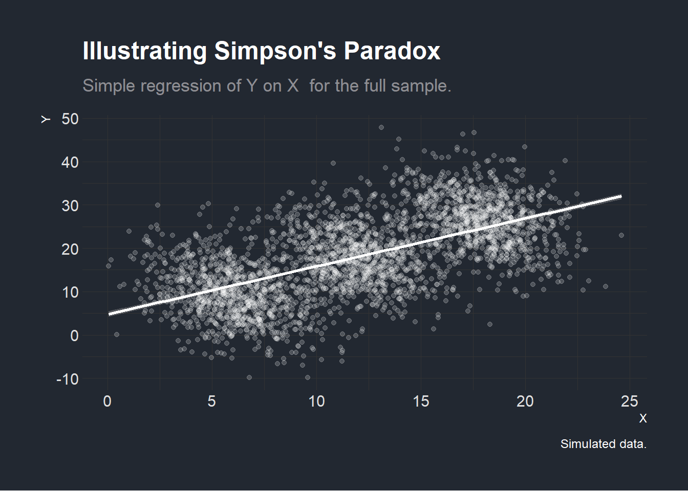
However, when running the regressions within each individual village, we find that the effect seems to be reversed! This illustrates the Association Reversal, described in the previous section (Samuels 1993).
# Plot with full sample grouped by village.
plotexample <- ggplot2::ggplot(example) +
  ggplot2::geom_point(ggplot2::aes(X, Y, colour = Group), alpha = 0.2) +
  ggplot2::geom_smooth(
    ggplot2::aes(X, Y),
    method = "lm",
    color = "white",
    formula = y ~ x
  ) +
  ggplot2::geom_smooth(ggplot2::aes(x = X, y = Y, color = Group),
                       method = "lm",
                       formula = y ~ x) +
  ggplot2::labs(title = "Illustrating Simpson's Paradox",
                subtitle = "Simple regression of Y on X  for the three villages individually.",
                caption = "Simulated data.") +
  HohgantR::themebernie()
# Display plot
plotexample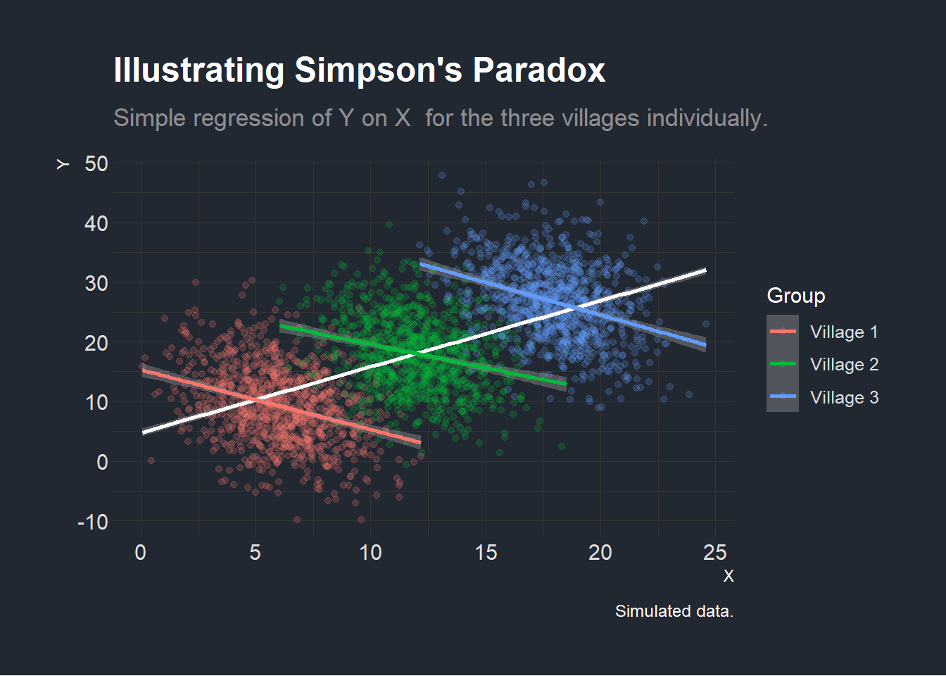
Let us quickly complement this visual intuition within a table with actual regression coefficients. Since we generated the data above, we already know the true village level association between our variables of interest and know the the village effect. We thus specify the naive regression of \(Y\) on \(X\) before looking at the effect within each village and finally specifying a regression with village level intercepts but a single \(\beta\).
# Display the OLS regressions in a simple table to show the different results
# when considering the full sample and considering the village-by-village
lmall <- lm(data = example, Y ~ X)
lmvillage1 <- dplyr::filter(example, Group == "Village 1") |>
  lm(formula = Y ~ X)
lmvillage2 <- dplyr::filter(example, Group == "Village 2") |>
  lm(formula = Y ~ X)
lmvillage3 <- dplyr::filter(example, Group == "Village 3") |>
  lm(formula = Y ~ X)
# The true regression with village level intercepts
lmfixedeffect <- lm(data = example, Y ~ X + Group)

stargazer::stargazer(
  lmall,
  lmvillage1,
  lmvillage2,
  lmvillage3,
  lmfixedeffect,
  type = "html",
  style = "aer",
  title = "Simple Regressions with Full Sample and Village level data",
  column.labels = c("Full Sample Naive",
                    "Village 1",
                    "Village 2",
                    "Village 3",
                    "Full Sample FE")
)| Y | |||||
| Full Sample Naive | Village 1 | Village 2 | Village 3 | Full Sample FE | |
| (1) | (2) | (3) | (4) | (5) | |
| X | 1.107*** | -1.002*** | -0.789*** | -1.093*** | -0.961*** |
| (0.026) | (0.093) | (0.095) | (0.095) | (0.054) | |
| GroupVillage 2 | 14.487*** | ||||
| (0.422) | |||||
| GroupVillage 3 | 28.932*** | ||||
| (0.703) | |||||
| Constant | 4.761*** | 15.316*** | 27.492*** | 46.366*** | 15.066*** |
| (0.343) | (0.591) | (1.156) | (1.713) | (0.380) | |
| Observations | 3,000 | 1,000 | 1,000 | 1,000 | 3,000 |
| R2 | 0.373 | 0.105 | 0.064 | 0.117 | 0.599 |
| Adjusted R2 | 0.372 | 0.104 | 0.063 | 0.116 | 0.599 |
| Residual Std. Error | 7.574 (df = 2998) | 6.084 (df = 998) | 6.084 (df = 998) | 5.986 (df = 998) | 6.055 (df = 2996) |
| F Statistic | 1,780.833*** (df = 1; 2998) | 116.827*** (df = 1; 998) | 68.635*** (df = 1; 998) | 132.690*** (df = 1; 998) | 1,493.680*** (df = 3; 2996) |
| Notes: | ***Significant at the 1 percent level. | ||||
| **Significant at the 5 percent level. | |||||
| *Significant at the 10 percent level. | |||||
We see in this regression table that the point estimates of \(\beta\) reflect our graphical analysis when we look at the full sample and the within-village estimations. The fifth and last model adds village level fixed effects to show that even if this estimation is consistent with the within village estimations in this case as all within village \(\beta\)’s are equal to \(-1\), this need not be the case if within village effects are heterogenous (different) across villages. This can be easily seen if one runs the DGP function defined above with values such as beta = c(-1, 0.5, -1). Simpson’s paradox can therefore not be solved by simply adding fixed effects.
Let us now convince ourselves that we did not get these results by chance as this was only one draw of our data generating function. To do that, we plot a distribution of the coefficient of interest \(\beta\) in the three regressions specified at the beginning of this section which we show below.
mcsimpson <- function(reps = 10) {
  datalist <- list()
  coefvectlst <- list()
  for (i in seq(reps)) {
    datalist[[i]] <- gensimpsondata(N = 1000)
    coefvectlst[[i]] <- vector()
    lmall <- lm(data = datalist[[i]], Y ~ X)
    coefvectlst[[i]][[1]] <- lmall[["coefficients"]][["X"]]
    lmvillage1 <-
      dplyr::filter(datalist[[i]], Group == "Village 1") |>
      lm(formula = Y ~ X)
    coefvectlst[[i]][[2]] <- lmvillage1[["coefficients"]][["X"]]
    lmvillage2 <-
      dplyr::filter(datalist[[i]], Group == "Village 2") |>
      lm(formula = Y ~ X)
    coefvectlst[[i]][[3]] <- lmvillage2[["coefficients"]][["X"]]
    lmvillage3 <-
      dplyr::filter(datalist[[i]], Group == "Village 3") |>
      lm(formula = Y ~ X)
    coefvectlst[[i]][[4]] <- lmvillage3[["coefficients"]][["X"]]
    lmfixedeffect <- lm(data = datalist[[i]], Y ~ X + Group)
    coefvectlst[[i]][[5]] <- lmfixedeffect[["coefficients"]][["X"]]
  }
  coefvectdf <- as.data.frame(do.call(rbind, coefvectlst))
  coefvectdf
}
coefsMC <- mcsimpson(reps = 200) |>
  dplyr::mutate(index = seq(200)) |>
  tidyr::gather(index, coefficient, dplyr::starts_with("V")) |>
  dplyr::mutate(
    index = replace(index, index == "V1", "Full Sample: Naive"),
    index = replace(index, index == "V2", "Village 1"),
    index = replace(index, index == "V3", "Village 2"),
    index = replace(index, index == "V4", "Village 3"),
    index = replace(index, index == "V5", "Full Sample: FE")
  ) |>
  dplyr::rename(Sample = index,
                Beta = coefficient)
# Density plot of different coefficients
freqmcsimpson <- ggplot2::ggplot(coefsMC) +
  ggplot2::geom_density(ggplot2::aes(
    Beta,
    group = Sample,
    color = Sample,
    fill = Sample
  ),
  alpha = 0.2) +
  ggplot2::labs(title = "Density Plot of Coefficient Estimates Under\nDifferent Specifications",
                subtitle = "Coefficients estimated by OLS",
                caption = "Monte Carlo Simulation: 200 iterations of synthetic DGP.") +
  HohgantR::themebernie()
freqmcsimpson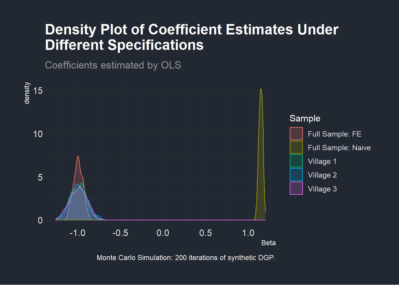
Simulations such as the one we just performed are a neat way of illustrating Simpson’s paradox. We have, however, not yet fully determined a method that would formally tell us at which level associations need to be considered in an observational study with actual empirical data. One way of seeing this is through what is known as Pearl’s Simpson Machine which will be the topic of a future post (Armistead 2014; Pearl 1993)!
PS: Please reach out if you spot any errors or have any comments and suggestions via the contact form.
Code Appendix
# Libraries
library(tidyverse)
library(MASS)
library(tidyverse)
library(stargazer)
library(dagitty)
library(ggdag)
# Load non-standard fonts with {extrafont}
extrafont::loadfonts("win")
extrafont::fonts()
# Function generating data affected by Simpson's paradox with an
# Association Reversal
gensimpsondata <- function(N,                         # Within village beta.
                           beta       = c(-1,-1,-1),  # Within village beta.
                           mu         = c(5, 10, 15), # Mean of X within village
                           sigmax     = rep(2, 3),    # SD of X within village
                           sigmau     = rep(6, 3),    # SD of error term
                           groupFE     = 15,          # Fixed effect of Group
                           name_groups = "Village") {
  groupNo <- seq(length(mu))
  groups <- paste0(name_groups, " ", groupNo)
  datasetlist <- list()
  for (i in seq(1, length(groupNo))) {
    datasetlist[[i]] <- dplyr::tibble(
      GroupNo = groupNo[[i]],
      Group   = rep(groups[[i]], N),
      GroupFE = groupNo[[i]] * groupFE,
      X       = rnorm(N, mu[[i]], sigmax[[i]]) + groupNo[[i]],
      # X depends on village level effects
      U       = rnorm(N, 0, sigmau[[i]])
    ) |>
      dplyr::mutate(Y = beta[[i]] * X + GroupFE + U)
      # Y depends on X and Village level effects.
  }
  out <- dplyr::bind_rows(datasetlist)
}
# Generate one iteration of the data called "example".
example <- gensimpsondata(N = 1000)
# Plot the example data.
# Plot with full sample.
plotexamplefull <- ggplot2::ggplot(example) +
  ggplot2::geom_point(ggplot2::aes(X, Y), color = "white", alpha = 0.2) +
  ggplot2::geom_smooth(
    ggplot2::aes(X, Y),
    method = "lm",
    color = "white",
    formula = y ~ x
  ) +
  ggplot2::labs(title = "Illustrating Simpson's Paradox",
                subtitle = "Simple regression of Y on X  for the full sample.",
                caption = "Simulated data.") +
  HohgantR::themebernie()
plotexamplefull
# Plot with full sample grouped by village.
plotexample <- ggplot2::ggplot(example) +
  ggplot2::geom_point(ggplot2::aes(X, Y, colour = Group), alpha = 0.2) +
  ggplot2::geom_smooth(
    ggplot2::aes(X, Y),
    method = "lm",
    color = "white",
    formula = y ~ x
  ) +
  ggplot2::geom_smooth(ggplot2::aes(x = X, y = Y, color = Group),
                       method = "lm",
                       formula = y ~ x) +
  ggplot2::labs(title = "Illustrating Simpson's Paradox",
                subtitle = "Simple regression of Y on X  for the three villages individually.",
                caption = "Simulated data.") +
  HohgantR::themebernie()
# Display plot
plotexample
# Generate featured gif with the example data. Does not appear in blogpost.
plot1 <- ggplot2::ggplot(example) +
  ggplot2::geom_point(ggplot2::aes(X, Y), alpha = 0.2) +
  ggplot2::geom_smooth(
    ggplot2::aes(X, Y),
    method = "lm",
    color = "white",
    formula = y ~ x
  ) +
  ggplot2::theme_void() +
  ggplot2::theme(
    panel.background = ggplot2::element_rect(fill = "#222831", color = NA),
    plot.background = ggplot2::element_rect(fill = "#222831", color = NA),
    legend.position = "none"
  )
plot2 <- ggplot2::ggplot(example) +
  ggplot2::geom_point(ggplot2::aes(X, Y, colour = Group), alpha = 0.2) +
  ggplot2::geom_smooth(ggplot2::aes(x = X, y = Y, color = Group),
                       method = "lm",
                       formula = y ~ x) +
  ggplot2::theme_void() +
  ggplot2::theme(
    panel.background = ggplot2::element_rect(fill = "#222831", color = NA),
    plot.background = ggplot2::element_rect(fill = "#222831", color = NA),
    legend.position = "none"
  )
ggplot2::ggsave(plot1,
                filename = "~/GitHub/Website/content/blog/2022-09-30-simpsonsparadox/plot1.png",
                dpi = 192)
ggplot2::ggsave(plot2,
                filename = "~/GitHub/Website/content/blog/2022-09-30-simpsonsparadox/plot2.png",
                dpi = 192)
# Display the OLS regressions in a simple table to show the different results
# when considering the full sample and considering the village-by-village
lmall <- lm(data = example, Y ~ X)
lmvillage1 <- dplyr::filter(example, Group == "Village 1") |>
  lm(formula = Y ~ X)
lmvillage2 <- dplyr::filter(example, Group == "Village 2") |>
  lm(formula = Y ~ X)
lmvillage3 <- dplyr::filter(example, Group == "Village 3") |>
  lm(formula = Y ~ X)
# The true regression with village level intercepts
lmfixedeffect <- lm(data = example, Y ~ X + Group)

stargazer::stargazer(
  lmall,
  lmvillage1,
  lmvillage2,
  lmvillage3,
  lmfixedeffect,
  type = "html",
  style = "aer",
  title = "Simple Regressions with Full Sample and Village level data",
  column.labels = c("Full Sample Naive",
                    "Village 1",
                    "Village 2",
                    "Village 3",
                    "Full Sample FE")
)
mcsimpson <- function(reps = 10) {
  datalist <- list()
  coefvectlst <- list()
  for (i in seq(reps)) {
    datalist[[i]] <- gensimpsondata(N = 1000)
    coefvectlst[[i]] <- vector()
    lmall <- lm(data = datalist[[i]], Y ~ X)
    coefvectlst[[i]][[1]] <- lmall[["coefficients"]][["X"]]
    lmvillage1 <-
      dplyr::filter(datalist[[i]], Group == "Village 1") |>
      lm(formula = Y ~ X)
    coefvectlst[[i]][[2]] <- lmvillage1[["coefficients"]][["X"]]
    lmvillage2 <-
      dplyr::filter(datalist[[i]], Group == "Village 2") |>
      lm(formula = Y ~ X)
    coefvectlst[[i]][[3]] <- lmvillage2[["coefficients"]][["X"]]
    lmvillage3 <-
      dplyr::filter(datalist[[i]], Group == "Village 3") |>
      lm(formula = Y ~ X)
    coefvectlst[[i]][[4]] <- lmvillage3[["coefficients"]][["X"]]
    lmfixedeffect <- lm(data = datalist[[i]], Y ~ X + Group)
    coefvectlst[[i]][[5]] <- lmfixedeffect[["coefficients"]][["X"]]
  }
  coefvectdf <- as.data.frame(do.call(rbind, coefvectlst))
  coefvectdf
}
coefsMC <- mcsimpson(reps = 200) |>
  dplyr::mutate(index = seq(200)) |>
  tidyr::gather(index, coefficient, dplyr::starts_with("V")) |>
  dplyr::mutate(
    index = replace(index, index == "V1", "Full Sample: Naive"),
    index = replace(index, index == "V2", "Village 1"),
    index = replace(index, index == "V3", "Village 2"),
    index = replace(index, index == "V4", "Village 3"),
    index = replace(index, index == "V5", "Full Sample: FE")
  ) |>
  dplyr::rename(Sample = index,
                Beta = coefficient)
# Density plot of different coefficients
freqmcsimpson <- ggplot2::ggplot(coefsMC) +
  ggplot2::geom_density(ggplot2::aes(
    Beta,
    group = Sample,
    color = Sample,
    fill = Sample
  ),
  alpha = 0.2) +
  ggplot2::labs(title = "Density Plot of Coefficient Estimates Under\nDifferent Specifications",
                subtitle = "Coefficients estimated by OLS",
                caption = "Monte Carlo Simulation: 200 iterations of synthetic DGP.") +
  HohgantR::themebernie()
freqmcsimpson
################################
## Citing all loaded packages ##
################################
knitr::write_bib(c(.packages(), "blogdown"), paste0(here::here(), "/blog/2022-09-30-simpsonsparadox/packages.bib"))References
Armistead, Timothy W. 2014. “Resurrecting the Third Variable: A Critique of Pearl’s Causal Analysis of Simpson’s Paradox.” The American Statistician 68 (1): 1–7. https://doi.org/10.1080/00031305.2013.807750.
Good, I. J., and Y. Mittal. 1987. “The Amalgamation and Geometry of Two-by-Two Contingency Tables.” The Annals of Statistics 15 (2): 694–711.
Mittal, Yashaswini. 1991. “Homogeneity of Subpopulations and Simpson’s Paradox.” Journal of the American Statistical Association 86 (413): 167–72. https://doi.org/10.1080/01621459.1991.10475016.
Pearl, Judea. 1993. “[Bayesian Analysis in Expert Systems]: Comment: Graphical Models, Causality and Intervention.” Statistical Science 8 (3): 266–69.
Samuels, Myra L. 1993. “Simpson’s Paradox and Related Phenomena.” Journal of the American Statistical Association 88 (421): 81–88. https://doi.org/10.1080/01621459.1993.10594297.
Simpson, E. H. 1951. “The Interpretation of Interaction in Contingency Tables.” Journal of the Royal Statistical Society: Series B (Methodological) 13 (2): 238–41. https://doi.org/10.1111/j.2517-6161.1951.tb00088.x.
Sprenger, Jan, and Naftali Weinberger. 2021. “Simpson’s Paradox.” In The Stanford Encyclopedia of Philosophy, edited by Edward N. Zalta, Summer 2021. Metaphysics Research Lab, Stanford University.
Footnotes
In this example, we refer to different levels of observations in a geographic sense. Partitioning the population could also be done across any observable characteristic of individuals such as gender as shown in the examples used by Simpson (1951) and Sprenger and Weinberger (2021)↩︎
See Stanford’s Plato entry for a formal definition.↩︎
Reuse
Citation
For attribution, please cite this work as:
Bieri, Bernhard. 2022. “Simulating Simpson’s Paradox.”
September 26, 2022. https://bernhardbieri.ch/blog/2022-09-30-simpsonsparadox/.